How to Choose the Right Typeface for Your Brand
Typography is far more than picking a font that looks nice. It's a fundamental element of your brand identity that communicates values, personality, and professionalism before anyone reads a single word of your content.
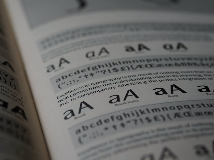
When choosing a typeface, consider your audience first. A law firm needs something different from a children's toy company. Your font choice should reflect the tone and values you want to convey. Serif fonts like Times New Roman feel traditional and trustworthy, while sans-serif options like Helvetica feel modern and clean.
Key factors to evaluate:
- Readability across different sizes and media
- Compatibility with your brand personality
- How it looks on screens versus print
- Licensing and availability across platforms
- Performance in various weights and styles
Don't fall into the trap of choosing something trendy that will feel dated in two years. The best typefaces are timeless. They work beautifully at small sizes on mobile devices and at large sizes on billboards. They remain legible whether printed in black or reversed out in white.
Most successful brands use a limited palette of typefaces—typically one or two for headings and one for body text. This consistency strengthens recognition. When people see your chosen font, they should immediately think of your brand.
Test your selection in real-world contexts. How does it look in your logo? What about on your website? Can customers easily read product descriptions? Does it work across your entire marketing collateral?
Remember that typeface choice is an investment in your brand's future. Take time to explore options, seek professional advice if needed, and make a decision you'll be happy with for years to come.